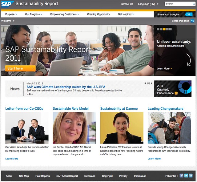
SAP launched its 2011 Sustainability Report this week and in terms of aesthetics and social sharing, this is one of the best Sustainability Reports I have seen to-date.
The site contains many videos with SAP staff – including one from co-CEO’s Jim Hagemann Snabe & Bill McDermott which is featured prominently on the home page. Interestingly there are also several customer reference videos as well with the customers vouching for how SAP have helped them become more sustainable.
There are also many blog posts and interesting stories from SAP employees talking about everything from Materiality, through to Electric Vehicles.
There is a whole section in the report dedicated to how SAP Empowers its customers. It includes customer video testimonials, white papers and some very impressive top line figures for savings (“5.7 million tons of estimated carbon reductions, saving $550 million in energy costs”). However the methodology for producing these data is not gone into in any detail in this section. I contacted SAP to voice my concerns about this and they assured me that in the next couple of weeks the report will be updated to include the methodologies, and the story around producing this innovative section of the report.
As you’d expect from SAP, there’s also a lot of data in the report on how they are doing on their journey to sustainability and it’s mostly positive results. Almost all of their numbers are headed in the right direction. Unfortunately the exceptions to this are in the environmental area with increases in Data Centre Energy, Total Energy consumed and SAP’s Greenhouse Gas Footprint.
On the data centre energy front, the energy increase is both in real terms, and in kWh per employee. This is likely due to SAP increasingly hosting customers data and applications through their cloud offerings. What might be interesting here would be to see a kWh per cloud customer metric, or similar. Also, one would suspect that there should be a net reduction in energy consumption for that application, if it is replacing a customer’s pre-existing on-premises application. There could be some interesting data to mine there around energy wins.
On the Total Energy Consumed page you see that energy consumption has increased from 843GWh in 2010 to 860GWh in 2011. In the report it attributes this to growth in the business (SAP bought SucessFactors during this period) but the lack of a kWh per Employee metric on this page makes this hard to verify.
On the Greenhouse Gas page, we again see an increase in emissions from the 453kTons 2010 figure to 490kTons in 2011. On this page, it is possible to see a By Employee figure and here too we see an increase in emissions from 8.7 tons per employee in 2010 to 9.0 tons in 2011. However, when we look at the emissions by ? revenue, we see a fall, from 36.3g/? in 2010 to 34.4g/? in 2011. 2011 was a good year for SAP, from a revenue perspective, it would appear.
On the upside, SAP has increased its use of renewable energy from 45% to 47%. Not a huge increase, to be sure, but at least this environmental metric is going in the right direction.
I mentioned that the site has a lot of social sharing built into it – there’s a “Share this page” on every page which allows you to share that page on your social network of choice (or print, or email!). However, in terms of interactivity, the report seems to have regressed. In the 2010 report, there was the ability to comment directly on any page, to rate comments, and see conversations taking place about the page, directly on the page. This functionality has been removed completely from the 2011 report, and to be honest, the report is the poorer for its removal. Browsing other readers comments on pages is always a superb way to gain others insights into the page content – both for consumers of the report, as well as for SAP.
From a UI perspective there are several glitches on the site (some rollovers not working; external links and links to PDF’s not made obvious; and inconsistent use of pretty permalinks etc.) but these are minor quibbles and easily fixed.
The 2010 report doubled individual visitors over the 2009 report, with the 2010 report receiving over 60,000 readers. SAP tell me they are aiming to maintain that progress and have over 120,000 visitors to this, the 2011 report. One huge advantage of having the report in the form of a website, is of course the invaluable data stream you receive from the visitor analytics to the report. Something which is impossible to achieve with a PDF.
On the whole, SAP’s 2011 report, with the removal of the interactivity and the increased energy and emissions, seems to have faltered slightly in terms of the tremendous progress it had been making to-date. To put that in perspective, SAP’s 2011 report is still one of the better produced sustainability reports.
For the 2011 report I’ll have to grade it as “very good, but could do better”.
Photo Credit Tom Raftery
Follow @TomRaftery


It’s 2012, how about an update. Also, .Net is a 2000’s suffix. Why don’t you spend some of your green money on a real domain name?